A Digital Must-Have: Design Systems
Design Systems allow digital products to be on brand and stay consistent through evolving product development and various creators.
To give you a better idea, you could more or less say it is a guidebook of all your core elements and assets that make up your digital product, which may be a website or an app, for example.
A well know design system methodology, you might have already heard of, is the so-called ‘Atomic Design’ by Brad Frost. What this basically comes down to is to define your single elements and assigning those (according to their roles) to specific collections (see below) to assemble the whole digital product.
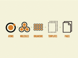
Brad Frost, Atomic Design
Atoms: Single elements like text, button
Molecules: Combination/ group of atoms, that combined create a function
Organisms: Again, a combination of molecules that create a complex section
Templates: Building a layout by using organisms (more like a wireframe)
Pages: High level fidelity instances of templates
What makes a Design System effective and what are its benefits?
Consistency
Consistency in brand development is key for various reasons. The most important in this respect is brand recognition. Users will be able to much better connect your digital products with your brand, hence this creates a better experience and brand reputation. Furthermore, everyone working in your team can build with ease from and on the existing guidelines.
Cross functional collaboration
A comprehensive developed and implemented Design System makes it so much easier for cross team communication (designers, developers etc.) to be on the same page. Additionally, it allows any new member to seamlessly get integrated by understanding the design language.
By doing so it will save your teams time and yourself money, in the long run.
Identifying problems & scalability
Developing a Design System might be challenging in the beginning, figuring out all, and only the necessary components, but will help you identify flaws and problems. Investing in it will allow ease of scalability and work flow.
What should be included in a Design System?
Basically, it is up to you how much you want to contain and define in your Design System, but of course there are certain components that should be featured nevertheless.
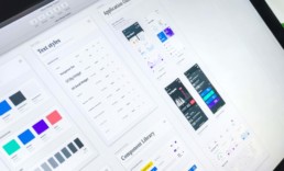
Style Guide
The style guide describes your visual design language. Consider defining it based on your brand guideline, since you want to keep your overall brand style consistent with your digital products. This should be your color, typography, imagery and sizing.
Component Library (UI kit)/ Pattern Library
A comprehensive collection of all components in use. Structure your library in a way so that those elements can be easily found when reusing them throughout your digital product.
Documentation
Give instructions on how to make use of your elements in the Design System, as well as how to address issued that may arise in the future.
Do you need help with your Design System?
Into the dark with Vantablack
Into the dark with Vantablack
"Discover the darkest materials of our planet"
Share
Originally, Vantablack has been developed by Surrey NanoSystems to eliminate stray light in satellites and telescopes and was unveiled in 2014.
What exactly is Vantablack? (I better quote this part!)
Vantablack is not a black paint, pigment or fabric, but is instead a functionalised ‘forest’ of millions upon millions of incredibly small tubes made of carbon, or carbon nanotubes. Each nanotube in the vantablack forest has a diameter of around 20 nanometres (that’s about 3,500 times smaller than the diameter of the average human hair), and are typically from around 14 microns to 50 microns long. A surface area of 1 cm2 would contain around 1,000 million nanotubes.
What can it do in general?
It absorbs 99.96% of the radiation in the visible spectrum and even beyond, including UV and IR. In addition, it is also hydrophobic and high thermal shock resistant.
What does it feel like?
From its look you might think it has some sort of a warm velvet feel. According to Steve Northam, Director of Business Development, it actually just feels like a smooth surface.
Vantablack vs. S-VIS vs. VBx1/2
Vantablack is not a pigment or a paint, but has ever since developed to be a more flexible coating. Vantablack S-VIS can be spray painted and does not need to be grown in a vacuum chamber. The Vantablack VBx1 and VBx 2 coatings in the visible spectrum are solvent based, pigmented coatings dispersed in a carrier solution.
Since its introduction to the world it has also found applications in automotive sensing, optical systems, art and aesthetics.
To present an example, in partnership with BMW and for the launch of the new BMW X6 the world’s first darkest car has seen the light of day (*no pun intended). The material has been completely covered in Vantablack and makes all shapes disappear, which basically means the only thing left you see are the parts not covered in Vantablack VBx2 such as headlamps, fog lamps, kidney grille, windows, and wheels.
Did you know that there actually is an even darker ‘blackest black’ than Vantablack?!
The “blackest black” material to date actually captures 99,995% of incoming light.
Watch the video below to find out more.
Pantone Color 2020
For over 20 years The Pantone Color Institute has been the leading color expert, setting color standards and color trends; influencing and collaborating with various industries, be it within fashion, graphic design, packaging and many more.
After a thoughtful selection process the Pantone 19-4052 Classic Blue was chosen as ‘Color of the Year’ 2020.
With a feeling of uncertain times on a worldwide scale this specific calming tone of blue symbolizes stability and a desire for a dependable future as we enter a new era.
“We are living in a time that requires trust and faith. It is this kind of constancy and confidence that is expressed by PANTONE 19-4052 […]Classic Blue encourages us to look beyond the obvious to expand our thinking; challenging us to think more deeply, increase our perspective and open the flow of communication”
Leatrice Eiseman (Executive Director of the Pantone Color Institute)
(Header picture – courtesy of The Pantone Color Institute)
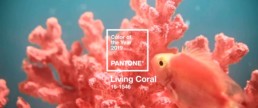
Pantone Color 2019
The next “color of the year” is quite a lively and vibrant one.
Pantone describes this color as “An animating and life-affirming coral hue with a golden undertone that energizes and enlivens with a softer edge.”
Pantone Official Website
The company explains on their website that the “Lively Coral” was chosen for the reason to get back to the roots and sort of disconnect from our technological influenced lives. Furthermore, the color expresses intimacy, authenticity and a desire for playful expression.
(Header picture – courtesy of The Pantone Color Institute)
A Colorful Collection
Ever heard of the Forbes Pigment Collection? The Straus Center for Conservation and Preservation at the Harvard Art Museums stores the Forbes Pigment Collection – a library that is definitely one of a kind.
It was the historian and director of the Fogg Art Museum at Harvard Universities Edward Forbes, who started the collection of pigments in the 1920s. Forbes was fascinated by a painting’s color, the techniques of a painter and how paintings could be restored, respectively. He travelled around the world to add pigments to his collection and hired chemist Rutherford Gettens to help analyze those. Roughly 2,500 rare and historic pigments (and their precise chemical composition) are stored in the vault, which can only be seen through glass windows.
Edward Forbes is seen as the father of the field of art conservation in the United States, not for nothing. The following are some highlights of the collection.
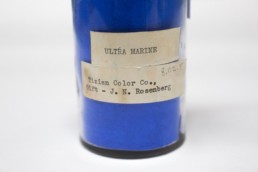
Ultramarine – A precious blue
Back in the day ultramarine was more expensive than gold. The lapis lazuli stone had to be mined in Afghanistan and then shipped to experts overseas, who were able to extract the blue hue from small particles of the stone. Hence, this deep blue powder was extremely expensive. It was used in medieval paintings.
Later, a chemist created a synthetic (chemically identical) version of this brilliant blue that made it affordable to people around the world.
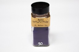
Mauve – The royal purple
Tyrian purple is a dye extracted from the murex shellfish that has an extremely eye catching color range. Due to it’s difficulty of manufacture, desirable shade and resistance to fade it was extremely expensive and therefore a status symbol – hence often called the ‘royal purple’.
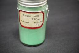
Emerald Green – A toxic shade of green
The crystalline emerald green powder of copper acetoarsenite is an extremely toxic pigment. Amongst others Vincent van Gogh used this pigment in his paintings, e.g. in the vibrant background of “Self-Portrait Dedicated to Paul Gauguin”. The poisonous fumes alone were a major health hazard.
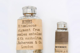
Mummy – A bizarre kind of brown
The so called mummy brown was gained by extracting the brown resing material of harvested mummies. People were obsessed in finding out how to recreate the rich brown that Rembrandt and Titian used in their masterworks.
Today, the collection has expanded and also includes modern pigments, which is used for comparison and scientific analysis.
Each year the Forbes Pigment Collection gets extended by additions of innovated colors, like the superblack Vantablack that absorbes 99.965% of light.
