
Into the dark with Vantablack
Into the dark with Vantablack
"Discover the darkest materials of our planet"
Originally, Vantablack has been developed by Surrey NanoSystems to eliminate stray light in satellites and telescopes and was unveiled in 2014.
What exactly is Vantablack? (I better quote this part!)
Vantablack is not a black paint, pigment or fabric, but is instead a functionalised ‘forest’ of millions upon millions of incredibly small tubes made of carbon, or carbon nanotubes. Each nanotube in the vantablack forest has a diameter of around 20 nanometres (that’s about 3,500 times smaller than the diameter of the average human hair), and are typically from around 14 microns to 50 microns long. A surface area of 1 cm2 would contain around 1,000 million nanotubes.
What can it do in general?
It absorbs 99.96% of the radiation in the visible spectrum and even beyond, including UV and IR. In addition, it is also hydrophobic and high thermal shock resistant.
What does it feel like?
From its look you might think it has some sort of a warm velvet feel. According to Steve Northam, Director of Business Development, it actually just feels like a smooth surface.
Vantablack vs. S-VIS vs. VBx1/2
Vantablack is not a pigment or a paint, but has ever since developed to be a more flexible coating. Vantablack S-VIS can be spray painted and does not need to be grown in a vacuum chamber. The Vantablack VBx1 and VBx 2 coatings in the visible spectrum are solvent based, pigmented coatings dispersed in a carrier solution.
Since its introduction to the world it has also found applications in automotive sensing, optical systems, art and aesthetics.
To present an example, in partnership with BMW and for the launch of the new BMW X6 the world’s first darkest car has seen the light of day (*no pun intended). The material has been completely covered in Vantablack and makes all shapes disappear, which basically means the only thing left you see are the parts not covered in Vantablack VBx2 such as headlamps, fog lamps, kidney grille, windows, and wheels.
Did you know that there actually is an even darker ‘blackest black’ than Vantablack?!
The “blackest black” material to date actually captures 99,995% of incoming light.
Watch the video below to find out more.
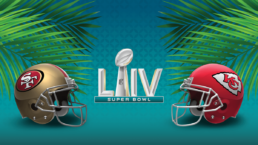
LIV Super Bowl - Commercials 2020
This 54th Super Bowl took place at the Hard Rock stadium in Miami, Florida, with the matchup between the San Francisco 49ers and the Kansas City Chiefs.
Like in the years before, this years big game ads were anything other than cheap. A 30 seconds spot was available for $5.6 million and according to FOX they sold the entire allotment by late November.
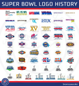
Before we dive right into this years overview of commercials, the NFL itself had something to celebrate as well – 100 YEARS OF NFL. According to the motto ‘Here’s to the next 100 and the game’s future stars!’ we’re celebrating the sport, which is lager than any team or individual, reaching and bringing people together from all across the US (and let me add worldwide).
Below, also find a well made animation graphic taking you through a brief history of NFL.
Agency: 72andSunny
Given the responses on the internet, it is fair to say that this years Super Bowl ads seem to have done quite well in general, with a a few exceptions of course. Nevertheless, this year ads did not spark a huge discourse, nor was there a single one that stood out in particular, like in the previous years.
Interestingly enough though, we were surprised to see two political ads from President Trump and Bloomberg, which we have not seen in recent history. According to a USA Today report the last political ad aired in a Super Bowl can be dated back to 1989.
A lot of commercials were star-studded again, featuring Ellen DeGeneres & Portia de Rossi, John Krasinski, Chris Evans, Maisie Williams, Post Malone’s, Martin Scorsese & Jonah Hill, Sam Elliot, Sylvester Stallone, Chrissy Teigen & John Legend, Jennifer Lopez, Tom Brady, Taraji P. Henson, Sofia Vergara …. and many, many, many, many more
DASHLANE
Agency: Lightning Orchard
Let me start with one of my favorite ads, that literally is to die for, because it’s simply hilarious and captures the essence of this business so very well!
ROCKET MORTGAGE
Agency: High Dive
Your home is the one place where you can truly be yourself. What a clever way make this topic approachable, fun and Jason Momoa is just the perfect person for this!
Did you ask yourself as well,…. how?!
Watch a behind the scenes video
MICROSOFT
Agency: McCann New York
Katie Sowers is the first woman to coach in a Super Bowl. Well done ad, that brings the message across in a very natural and positive way.
SNICKERS
Agency: BBDO New York
Seeing mixed opinions of a ‘Snickers-hole’ that’s feeding the world some Snickers. You make up your mind on this one… I’m fine with just the candy bar.
HULU
Whether you like Tom Brady or not, is Hulu missing the point when using a double meaning that mostly gets people talking about the player not the service?
SQUARESPACE
Agency: In-house
I really don’t mind simplicity but without the context of the extended version of the ad it’s extremely difficult to follow!
Quite confusing… don’t worry I can create your website 😉
Beer Branding
According to the American Brewers Association total US beer sales were 1% down in 2018, nevertheless craft beer sales have shown an increase of 4% – claiming 13,2% of the beer market.
Despite the slight decrease in total sales it is inevitable to say that the beer industry is however a significant market defined by $114.2 billion sales, hence offering huge economic potential.
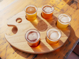
Craft brewing
The trendy word of ‘Craft Brewery’ has come to spread thanks to the popularity of rather smaller, and independent commercial breweries with the goal of making stronger and more variable flavours of beer. The exact definitions for that may be tricky to recognize, especially for a casual beer lover; so simply seek the certified independent craft seal to identify a U.S. craft brewer.

The growing number of US breweries provides business opportunities and at the same time inflames a battle of successful (long-term) market establishment and market dominance.
Therefore, it is ever more important to not only win over your customers with a deliciously refreshing beer, but taking it a step further than the competition and creating an over all brand appearance that will distinguish yours from the rest.
BASIC KEY INGREDIENTS
1. Developing a game plan for a tasty beer
I better leave this part to you – the brewmaster!!
Definitely offering my services as a taster.
2. Define & position your brewery
The most important question you have to ask yourself when defining your brewery’s brand position is ‘Why?’. Understanding what makes your brewery unique to identify the differentiation to your competition. What are your core values, who is your ideal customer and why should someone be interested in your brewery, let alone buy your beer? What emotions should your brewery provoke?
What is your brewery’s story/history, where is it located and what end game do you pursue regarding distribution.
Getting aware of all this might even be a helpful tool to discover your tagline, think about ‘Born in the rockies’ (Coors), ‘One Life, Right? Don’t’ blow it.’ (Kona Brewing), ‘Beer for punks’ (BrewDog) or ‘Dam Good Beer’ (10 Barrel Brewing).
3. Define your brewery through branding
- Name
- Brand System (logo, colors, typography, visual elements…)
- Label, Packaging Design
- Print Assets
- Website
- Environmental Design, Signage
Name
As with most brand names there are few aspects you should consider when deciding on a brewery name. Reflect on your brand history, niche and values to find a name that is relatable.It should be easy to remember. In addition, check that there aren’t any cultural misconceptions!
For brewery names, specifically, evaluate whether additional product lines can be integrated.
Last, but not least, make sure the name hasn’t already been claimed. To be 100% certain you can also contact a (trademark) lawyer.
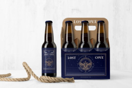
Brand System
Of course, your logo (and tagline) will be an essential asset of your brand system and will find application in print assets, labels, packaging, merchandising etc. Apart from the main logo you might want to develop additional elements like icons and patterns. When creating those remember that typography and color have a huge impact on how your brand is being perceived in the very first seconds, eg. bold, vintage, modern etc.
It is also important to have your designer develop a brand guideline to define its usage.
Print Assets
You will need various print assets when for advertising, flyers, menu cards etc. Your designer should be able to create a cohesive look based on your brand system.
Label, Packaging Design
Make sure to use durable, waterproof labels
Keep in mind! Packaging/Labels need to have all required information and be approved e.g. by TTB (US) or according to EU’s provisions on food labelling.
Website
Investing in a website is essential to give your (prospective) customer the nitty-gritty information like products, location(s), opening hours, brewery tours, and in the long-run you might even expand and include events and a shop.
Be sure to develop a responsive website, which basically means that the layout adapts to different sizes of devices, like mobile and tablet and consider investing in SEO (so your website is ranked high on search engines).
While your website might be under construction, I suggest that you make use of an online presentation by teasing or giving most necessary information with a microsite. Meanwhile, it is also a good idea to think about your social media presence and include it in your marketing plan. Those platforms are more or less free tools to promote your beer/brewery. With frequent updates you can attract, inform, connect with new customers and/or visitors easily.
Environmental Design, Signage
With an environmental design you have the possibilities to turn your brand story into a brand experience. When customers visit your brewery you want to captivate them and live your brand values in a ‘3D space’. The way your brewery space will be designed, use of materials, atmosphere, music, signage etc. will give them a well rounded, cohesive experience.
Are you a brewmaster who needs a hand with brand strategy & design?

Pantone Color 2020
For over 20 years The Pantone Color Institute has been the leading color expert, setting color standards and color trends; influencing and collaborating with various industries, be it within fashion, graphic design, packaging and many more.
After a thoughtful selection process the Pantone 19-4052 Classic Blue was chosen as ‘Color of the Year’ 2020.
With a feeling of uncertain times on a worldwide scale this specific calming tone of blue symbolizes stability and a desire for a dependable future as we enter a new era.
“We are living in a time that requires trust and faith. It is this kind of constancy and confidence that is expressed by PANTONE 19-4052 […]Classic Blue encourages us to look beyond the obvious to expand our thinking; challenging us to think more deeply, increase our perspective and open the flow of communication”
Leatrice Eiseman (Executive Director of the Pantone Color Institute)
(Header picture – courtesy of The Pantone Color Institute)
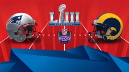
LIII Super Bowl - Commercials 2019
Agency: 72andSunny SPOILER: WINNER! Not sure it’s fair to say that an ad for the NFL can be the winner of them all, but it simply is! Celebrating its 100th anniversary more than 40 current and former NFL Players have come together to make this ad truly stand out showing the passion for the game in all its glory- or should I say messy banquet hall.
Did you watch the big game? Well, let’s get down to business. If you wanted to appear on the big screen at this years LIII Super Bowl you had to put $5 million and up on the table. Hereby CBS was pretty much on the same level in comparison to NBC’s pricing last year.
Homerun for CBS
Apart from all the hype of the most anticipated ads in a year don’t forget to keep an eye on how CBS promoted its network including CBS all Access and Showtime.
Companies are increasingly taking their new brands and products to the big stage
Accomplished, well-known brands take a step further seeing the value in promoting new products. There’s no bigger platform to grab millions of potential customer’s attention that ‘easily’. Basically, it’s guaranteed that people will actively pay attention, not mentioning the social impact. However, such companies can’t make a lightly decision about going into the Super Bowl- in the end it’s a $7 – $10 million outlay. It definitely depends on the product and the creative. This year companies like PepsiCo, Kraft-Heinz and Anheuser-Busch were going for this marketing strategy.
- Kraft-Heinz: Frozen Food Brand Devour
- Anheuser-Busch: Budweiser (Copper Lager), Michelob Ultra (Pure Gold), SpikedSeltzer (Bon & Viv)
PepsiCo – Spotlighting it’s 1 year old water brand Bubly feat. Michael Bublé
Agency: Merkley+Partners
Super Bowl Commercial contenders, who will score a TD?!
Automotive: Mercedes-Benz, Audi, Hyundai, Kia, Toyota, Lexus, Jaguar
Airlines & Travel: Turkish-Airlines, Norwegian Cruise
Food & Beverage: Bud Light, PepsiCo, Pringles, Avocados from Mexico, M&Ms, Bon & Viv, Doritos, Devours, Skittles, Planter, Bubly, Pizza Hut, Budweiser, Burger King, Stella Artois, Michelob Ultra, Planters
Consumer Goods: Colgate, Olay, Persil
Media & Online: T-Mobile, Mint Mobile, Verizon, Bumble, Wix, Hulu, Amazon
Others: TurboTax, SimpliSafe, WeatherTech, Sketchers
Mercedes Benz – Say the Word feat. Ludacris
Agency: Merkley+Partners
This Mercedes ad has not really been mentioned in either the top or the bottom section, but it definitely made it on my top list. It’s just simple, not trying too hard, puts a smile on your face and most importantly brings the message across- own a Mercedes, and get what you actually want.
Amazon – Alexa, Not everything makes the cut
Agency: Lucky Generals
Alexa might not have made the cut in all sorts of products, however Amazon did with their commercial. It was one of the more pleasing ones to watch, probably also because of Harrison Ford’s acting.
Bud Light & Game of Thrones
Agency: Wieden+Kennedy, Droga5
The genius collaboration of Bud Light and Game of Thrones scored a TD amongst the viewers! The creative twist in the end of the commercial, despite the risky move of having the Bud Knight getting knocked off his horse, turned out to be a huge success. The unexpected crossover with the teasing of the final season of Game of Thrones definitely got everyone talking about it.
Sketchers – Easy feat. Tony Romo
Agency: Wieden+Kennedy, Droga5
Whether you’re a Cowboys fan or not, how can you not like Tony Romo?! – It might not be a smashing commercial but come on “Romo Mode” and that smirk, just pure entertainment!
Given the fact that PepsiCo was an official sponsor of the NFL, which was held in Atlanta- the hometown of Coca Cola- it’s interesting to take a look at them as well.
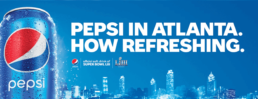
PepsiCo undeniably had their full branding game on, eg. they put up ads all over Atlanta with slogans like ‘Look who’s in town for Super Bowl LIII’ and ‘Pepsi in Atlanta, how refreshing.’ An extremely witty way to approach the rivalry between those beverage giants.
When it comes to their big Super Bowl ad it’s not quite sure whether the question ‘Is Pepsi OK?’ will be answered with certainty. The commercial is not bad, but it also doesn’t really hit the mark, rather features a mess of celebrities.
What you could also observe was that a lot of companies used cross media marketing extensively to get the most of their ads, spendings, respectively. Basically this is not a new strategy at all, however this omnichannel approach has been extended so that brands started to create a wider story around their messaging. Whether it is an extended ad, short movie, live-stream, online game etc. the viewer is supposed to interact with the brand in a deeper way.
Overall, the commercials this year really tried to stay away from anything controversial or politic and focused on sending across positive messages including climate change, diversity, unity, empowerment and human connection.

Package Design Makes A Difference
Packaging, branding and vice- versa; make your brand storytelling work on all mediums.
Once you’ve defined your brand, brand strategy respectively, it should be relatively easy to identify what your brand stands for and in what way this can be represented via packaging. Of course, this also works vice-versa, because how much you invest in your packaging reflects on your brand as well. Cohesiveness is probably one of the most important keywords here.
First impressions matter
First impressions generally take only a few seconds, therefore effective packaging is important to:
- grab the (potential) consumer’s attention
- convince him of the product (which he might not even know) or
- make him consider/take a closer look at it and
- ultimately make him decide to chose your product over the competition
Design that stands out
Your packaging represents your brand and consequently it’s promise to deliver a quality product and experience. There are multiple factors given the design that can make a difference and create an impact or not.
Aesthetics
As mentioned before, stick to your overall brand style and transfer your art of storytelling onto your packaging. Keep in mind that your choice of packaging material can have a huge impact regarding quality.
Color
Color is an important aspect when designing your packaging. It’s one of the first things that can grab your customers attention. However, when choosing colors consider whether it fits to your brand, as well as the psychology and cultural usage of it, to make sure you’re sending the right message.
Icons
In our age of digitization emojis and icons have become a crucial element, and are often even understood internationally. Such icons can come very handy as they not only have a specific meaning, but also are connected to memories and feelings.
Emotions
All of the above definitely contribute to create a certain feel, and consequently trigger specific emotions within your customer. Therefore, it’s important to know your target group and build a connection with them. Such emotions can lead to long-term relationships between the customer and the product (brand), which is the ultimate goal.
Depending on the product you’re trying to sell, envision how it might look like on a shelf next to each other and/or surrounded by competitors.

Unpacking the Design
So far you put all consideration into account given the design aspect. However the process does not stop here. I’m pretty sure you once bought a product that was shrink-wrapped in plastic and you had to work your way around with scissors to finally hold the product in your hands…
This is an example of bad user experience and could lead to the consumer, as satisfied as he might be with the product, next time standing in front of the shelf consider grabbing the competitor, because he remembered the struggle of opening.
It is utterly important to think about the whole user experience when unpacking, so the customer will be instantly confirmed to have bought something of good quality, and has a great first impression.
Do you have a packaging project coming up?

Why to rebrand
Embrace a rebrand
A company’s brand identity is the fundamental that ‘it’s built on’. Above all it states its core values and defines what image it represents. However, a brand identity is never completely finished and needs to be adapted from time to time.
A rebrand is necessary due to different changes within and outside of the company, be it that your audience expands, the company’s goals change or due to technological progresses and future trends.
SO WHAT EXACTLY IS A REBRAND?
Generally speaking it’s an overhaul of your existing brand image. This may include a new brand strategy, a new brand positioning and a new brand image (logo, typography, graphic assets).
Of course, a rebrand does not always have to be as far fetched – sometimes just a logo redesign can be enough to refresh your brand.
Do you need help with a rebrand?
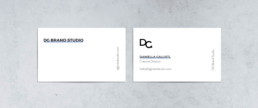
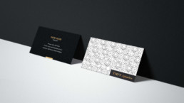
The Art of Introduction
Make your business cards stand out
Networking and making connections is essential in every area of our social life. Even though it might not be face to face all the time these days, you definitely want to make the most out of your “direct contact approach”. This is especially important when you want to make your first impression count. A handshake can be forgotten quite easily, not so much a unique business card with your contact information that will appear in someone’s purse later on.
Make a memorable introduction with your business cards!
A business card is not just a simple piece of paper with your contact details on them, but a representation of your brand your business, respectively. Hence, hiring a professional, who understands your brand values/ identity and is aware of the various print options is important. This way those values get translated on your business cards. The possibilities regarding design and print process are very broad, so it’s best to invest your money once, and wisely.
Did you know?
Back in the 17th century “business cards” or better so-called “visiting-cards” were used by the aristocracy when attending an event. In order to praise the arrival of the guest such cards were handed over to the servants to get introduced.
Later on those cards were essential for anyone of the upper class to bring to every household they would visit. Vice-versa they were collected from those visiting.
Another form of business cards that was used, particularly in London, during this period were “trade cards”. Such trade cards were usually a form of business advertisement that included a map and directions. A pretty clever way to promote your business, considering systematic street names and numbers haven’t been quite developed back then. Those cards were often printed with woodcut or letterpress (something we can’t get enough of nowadays).
During the Industrial Revolution it became essential for the rising middle class to exchange contact information (on plain, heavy paper & with clear lettering), which can be seen as a combination of visiting and trade cards- a first version of our modern business cards today.
To sum up, investing in the design and quality of your business cards is essential in order to impress your opposite and stay relevant.
- With business cards you can make your (first) impression count
- They are very effective direct marketing tools
- Their design & quality can be unique – and make you stand out
- Business cards show that you are prepared
Do you need new business cards?

Pantone Color 2019
The next “color of the year” is quite a lively and vibrant one.
Pantone describes this color as “An animating and life-affirming coral hue with a golden undertone that energizes and enlivens with a softer edge.”
Pantone Official Website
The company explains on their website that the “Lively Coral” was chosen for the reason to get back to the roots and sort of disconnect from our technological influenced lives. Furthermore, the color expresses intimacy, authenticity and a desire for playful expression.
(Header picture – courtesy of The Pantone Color Institute)

A Colorful Collection
Ever heard of the Forbes Pigment Collection? The Straus Center for Conservation and Preservation at the Harvard Art Museums stores the Forbes Pigment Collection – a library that is definitely one of a kind.
It was the historian and director of the Fogg Art Museum at Harvard Universities Edward Forbes, who started the collection of pigments in the 1920s. Forbes was fascinated by a painting’s color, the techniques of a painter and how paintings could be restored, respectively. He travelled around the world to add pigments to his collection and hired chemist Rutherford Gettens to help analyze those. Roughly 2,500 rare and historic pigments (and their precise chemical composition) are stored in the vault, which can only be seen through glass windows.
Edward Forbes is seen as the father of the field of art conservation in the United States, not for nothing. The following are some highlights of the collection.
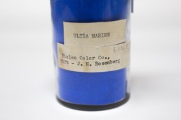
Ultramarine – A precious blue
Back in the day ultramarine was more expensive than gold. The lapis lazuli stone had to be mined in Afghanistan and then shipped to experts overseas, who were able to extract the blue hue from small particles of the stone. Hence, this deep blue powder was extremely expensive. It was used in medieval paintings.
Later, a chemist created a synthetic (chemically identical) version of this brilliant blue that made it affordable to people around the world.
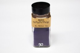
Mauve – The royal purple
Tyrian purple is a dye extracted from the murex shellfish that has an extremely eye catching color range. Due to it’s difficulty of manufacture, desirable shade and resistance to fade it was extremely expensive and therefore a status symbol – hence often called the ‘royal purple’.
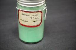
Emerald Green – A toxic shade of green
The crystalline emerald green powder of copper acetoarsenite is an extremely toxic pigment. Amongst others Vincent van Gogh used this pigment in his paintings, e.g. in the vibrant background of “Self-Portrait Dedicated to Paul Gauguin”. The poisonous fumes alone were a major health hazard.
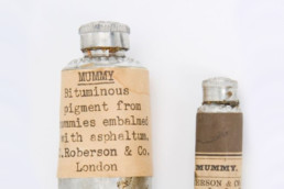
Mummy – A bizarre kind of brown
The so called mummy brown was gained by extracting the brown resing material of harvested mummies. People were obsessed in finding out how to recreate the rich brown that Rembrandt and Titian used in their masterworks.
Today, the collection has expanded and also includes modern pigments, which is used for comparison and scientific analysis.
Each year the Forbes Pigment Collection gets extended by additions of innovated colors, like the superblack Vantablack that absorbes 99.965% of light.